We are Absolute Austro-Libertarians, but so far, we have been focusing on the Libertarian part of our beliefs. Now it is time to focus on the Austrian part of things.
Your regular questions about Austrian Economics can be answered in Wikipedia Austrian School. This is not why we are here.
In future lessons we will expand on the principles of Austrian economics in more detail. However, for now, we would like you to have a taste for what it is.
We are here to show you how Austrian Economics works in reality. The only problem with this is, of course, that Austrian Economics does not believe in economic calculations. Even if it would believe in them, they would still be too obscure and complex to understand without a degree in Economics.
So, we are going to draft a tool to help us out. We are going to use statistics.
We fully understand that Austrian Economics despises statistics (it being part of mathematics), but we will suspend disbelief for this lesson and assume that at least the Gaussian distribution works as acceptably well and as intended.
For those purists out there, we know that that this distribution has been discredited and that much more modern and empirical ways to obtain distributions have been put forward. We are not trying to create an economic text book, we are only trying to illustrate the basics. For this purpose, the Gaussian distribution will work just fine.
What is Statistics?
Glad you asked.
Statistics is the “science” (some people would object to that name) that attempts to extract information from a group of things (people included) whose individual behavior cannot be forecasted.
For example, we may not know which ice-cream flavor each individual person in a group may prefer, but if we have sufficient purchase tickets, we can calculate which flavor is preferred by the group. If you are interested, this happens to be vanilla.
In this way, we can forecast that given a group of people purchasing ice-cream, a certain percentage of them will purchase vanilla. If our statistical methods are correct, we will be close to reality within a margin of error.
For example, if our calculations show that 47% of people prefer vanilla, that number also carries an error with it. Statistics can actually estimate such an error. When statistical numbers are quoted, they are usually quoted as this example: 47% of people prefer vanilla with a 95% of certainty.
This 95% means that if we study 100 groups eating ice-cream, we will find that in 95 of them 47% of their people prefer vanilla. However, we will also find that in the remaining 5 groups, the number won’t be 47%, it will be either higher or lower.
This error is simply uncertainty. It is not possible to get rid of it. The universe is built in such a manner as to reject absolutes. We don’t know why, it just is.
What is a distribution?
The most important tool in statistic’s arsenal is the distribution. As its name implies it is just a visual representation (a picture) of how stuff that we are studying is being distributed in a group.
Let’s take another example. Let’s take a bunch of people at random and get their yearly net income. This is all the money they keep in their pockets after paying all taxes. This is the “real” amount of money they can spend per year.
If we do so, we will get a list that looks like this:
|
Person Number |
Net Income |
|
1 |
100 |
|
2 |
250 |
|
3 |
89 |
|
4 |
670 |
|
5 |
44 |
|
6 |
97 |
Now, we create a few buckets of net income range. To keep things simple, we choose:
|
Bucket (income range) |
|
0 – 50 |
|
50 – 100 |
|
100 - 1000 |
Now we look at how many people from our list are in each bucket:
|
Bucket (income range) |
Number of people |
|
0 – 50 |
1 |
|
50 – 100 |
3 |
|
100 - 1000 |
2 |
Now we put those numbers in a nice plot:
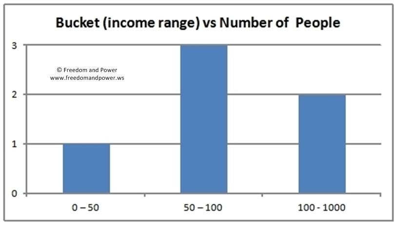
If we ask thousands of people and we do this process again, we get something like this:
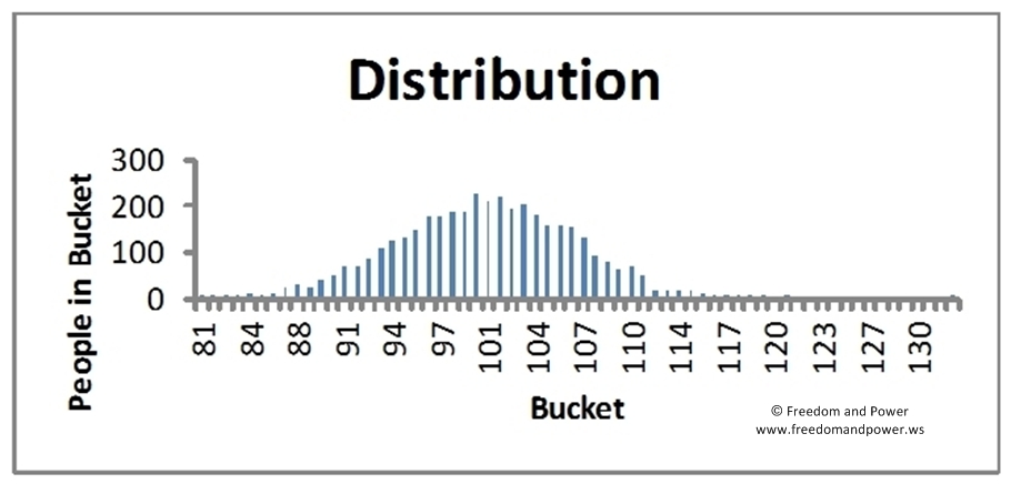
And then, if we remove the bars and link all the top points, we get a curve like this:
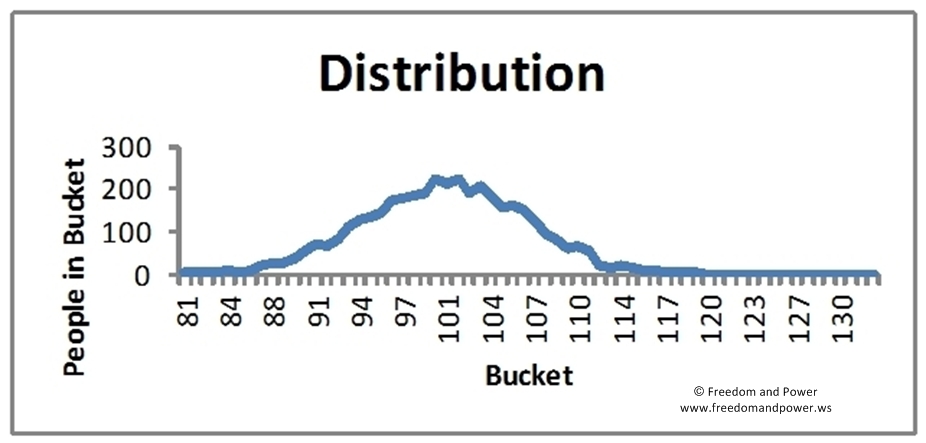
Now, if we repeat this process using 10,000 or 100,000 people, we get a smooth curve like this:
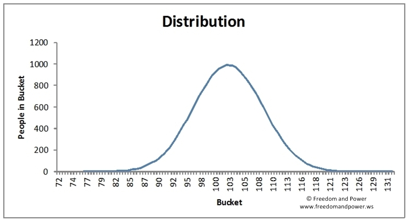
This is what a mathematician called Gauss saw and deduced a formula for. We won’t bother you with details. Suffice to say that it is called the Gauss curve or the bell curve, owing to the bell-like shape it has.
This is the distribution we are going to use.
THREE COUNTRIES
We are now going to study the properties of this curve, through the eyes of three different countries. We will call them Poorland, Avergaland and Richland. They are part of a common economic area and their currency is the PAR dollar, whose symbol is $. Strangely enough, they have about the same population and about the same natural resources.
Averageland
The curve for this country is as follows:

What can this curve tell us?
If we look at the peak of the curve, we notice that the vast majority of the people are on the peak or nearby. If we calculate a simple average of all Average citizens’ net income, we get about 103 $. This is the net income of an average citizen. It is also the net income of people that are neither poor nor rich. What we would call the Middle Class of Averageland.
If we move to the left in the curve, we notice that the net income decreases, but also that the number of people decreases with it. This makes sense. In any given country, there are fewer poor people than middle class.
If we now move to the right in the curve, we notice something similar. As income increases, the number of people decreases. Again, this makes sense. In any given country, there are fewer rich people than middle class.
There are also a few numbers we need to point out because we will be using them latter on throughout this lesson.
The numbers are:
- Middle Class Net Income: about $103
- Poor Class Net Income: about $83
- Rich Class Net Income: about $123
- Number of people in the Middle Class Bucket: about 1000
Before continuing we need to state that we cheated a little bit in those numbers. The Middle Class Net Income and the number of people in that Bucket were calculated mathematically. The distribution decides those numbers. However, the Net Income at which the Poor Class and the Rich Class starts is purely subjective. We made that decision, not the distribution. This is an important distinction to keep in mind.
Poorland
Poorland neighbours Averageland to the north and they are, well, poor. We performed the same calculations as for Averageland and obtained the following distribution:

We see the same type of curve, but the numbers have now shifted:
- Middle Class Net Income: about $85
- Poor Class Net Income: about $68
- Rich Class Net Income: about $103
- Number of people in the Middle Class Bucket: about 1000
Richland
Let’s now take a look at Richland’s distribution:
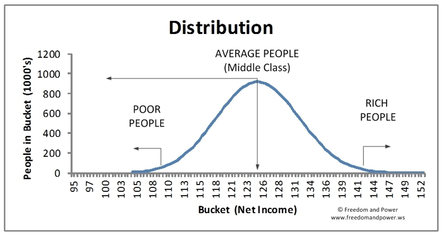
It is obvious that the numbers have also shifted:
- Middle Class Net Income: about $125
- Poor Class Net Income: about $109
- Rich Class Net Income: about $142
- Number of people in the Middle Class Bucket: about 1000
A tale of three countries
Now let us compare all three countries and see if we can deduce anything interesting. Let’s overlap all the curves:

A convenient table will also help us out:
|
|
Poorland |
Averageland |
Richland |
|
Poor Class Net Income |
68 |
83 |
109 |
|
Middle Class Net Income |
85 |
103 |
125 |
|
Rich Class Net Income |
103 |
123 |
142 |
|
Number of people in the Middle Class Bucket |
1000 |
1000 |
1000 |
What can we conclude?
The distribution curves did not change shape. What happened is that the curves moved from the center which was Averageland. They moved to the left for Poorland and to the right for Richland.
The number of people in the Middle Class Bucket did not change either.
The difference in PAR $ from Poor Class to Middle Class to Rich Class is about $ 20, regardless of which country we look at.
The PAR $ difference between Poor Classes in Poorland, Averageland and Richland is also about $20. The same happens for Middle Classes and Rich Classes.
There is an important economic lesson here. Whether the group of people we are studying is poor, average or rich, the distribution does not change much.
We don’t know why this is. Over the years, many people have tried to explain it and have failed. We need to keep this in mind.
This point is important because this curve is a naturally occurring curve. This means that an economic system left to its own devices will create such a curve all by itself. People trying to tamper with it will be confronted with the awesome force nature.
We must also point out that Net Income, particularly the Middle Class Net Income, matters. It does so because it is a quantifiable measure of Quality of Life. It is not a perfect measure, but it is a fairly good one. It is also one that does not require subjective assumptions or determinations.
Note: please see the Glossary if you are unfamiliar with certain words.
Continue to Austrian Economics In Pictures - Part 2


