This project was developed as a continuation of the project Default Index. It attempts to provide some perspective as to how fast the economic situation of a given country is improving or deteriorating. It utilizes the same principles as the project Default Index, but its purpose is to measure the speed towards the average default point or from it.
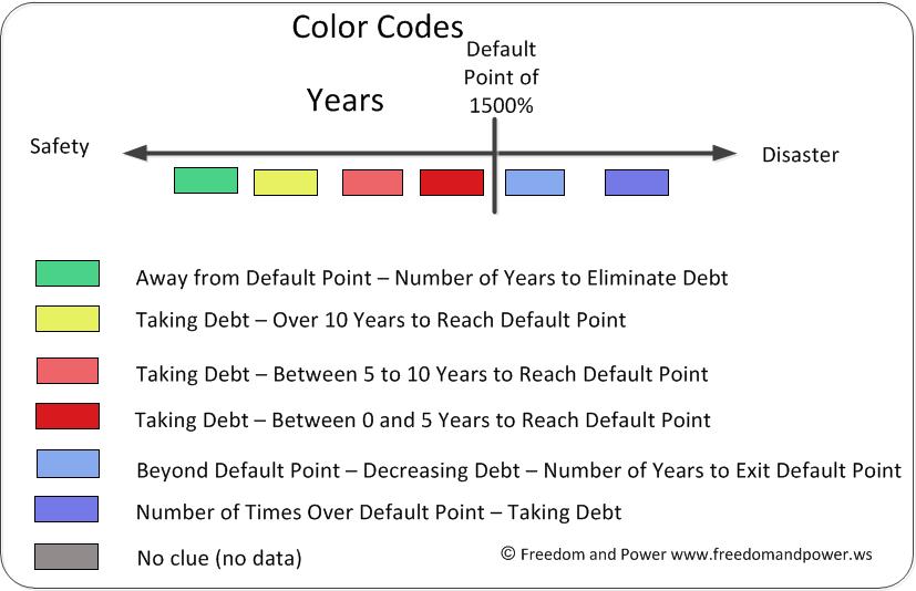
The following picture provides the color codes to understand the table.

Green: this means that the country is relatively far away from the Default Point and eliminating debt. The number inside of the cell is the number of years necessary to eliminate all country debt, assuming that the velocity at which the debt is decreasing remains constant. The lower the number, the better the economic position of the country.
Yellow: this means that the country will take more than ten years to reach the Default Point. The country is increasing debt and the number inside of the cell indicates the number of years it will take the country to reach said point, assuming the increase in debt is constant. The larger the number, the better the economic position of the country.
Pink: this means that the country will take between 5 to 10 years to reach the Default Point. The country is increasing debt and the number inside of the cell indicates the number of years it will take the country to reach said point, assuming the increase in debt is constant. The larger the number, the better the economic position of the country.
Red: this means that the country will take between 0 to 5 years to reach the Default Point. The country is increasing debt and the number inside of the cell indicates the number of years it will take the country to reach said point, assuming the increase in debt is constant. The larger the number, the better the economic position of the country.
Light Blue: this means that the country has passed the Default Point, but it is decreasing its debt. The number inside the cell is the number of years it will take the country to retreat from the Default Point, assuming the velocity of debt decrease is constant. The larger the number, the worse off the country is. We have placed a limit on the calculation of 200 years.
Dark Blue: this means that the country has passed the Default Point, and it is increasing its debt. The number inside the cell is the number of times the country has surpassed the Default Point. The larger this number, the worse the economic conditions of the country.
This is the table of countries. The first column contains the name of the country, the first row contains the year and the last column includes the first year the IMF estimated data. Lastly, the columns for 2013 and 2014 have double-lined walls for easy recognition.

Take a look at yours.
Commentary
One of the interesting observations is that countries in Light or Dark Blue oftentimes pass from a Default Point to a much better economic conditions within a single year. Our guess is that this reflects either defaults or, more likely, government austerity programs. By cutting the debt drastically (usually by selling government properties), governments get out of tight economic situations literally overnight (i.e. within a year or so).
Another interesting observation in this table as well as in the Default Index table is that not all countries are the same. Some countries seem to be able to remain pass the Default Point for very long periods of time without mayor consequences. Take Italy or Japan, for example. This would point to a psychological effect because this would not be possible without bond markets' agreement. It is obvious that the capacity to repay debts is based on make-belief or political calculations, not on economic reality.
Also, if you want the entire table, including all the years for which the IMF had data, please download the attached Excel or PDF file.
Have fun with the data!
TECHIE STUFF
We calculated the velocity of each countries' debt as the first derivative of a 9 point quartic moving average. In order to do so, we used the Savitzky-Golay algorithm, which can be found in Wikipedia - Savitzky-Goay.
Truth be told, we could have used a simple difference of debts between years as a velocity approximation, but the advantage of using the S-G algorithm is that it smooth's out the noise. This, in turn, allows for a much better view of trends, if any.
Since we used a 9 point moving average, the first 4 points and the last 4 points of any series cannot be calculated.
Data was again obtained from the International Monetary Fund.


